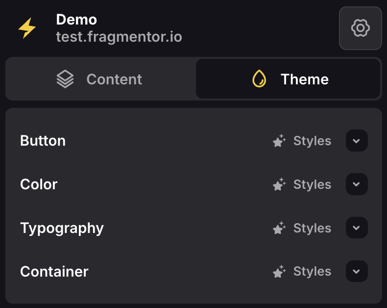
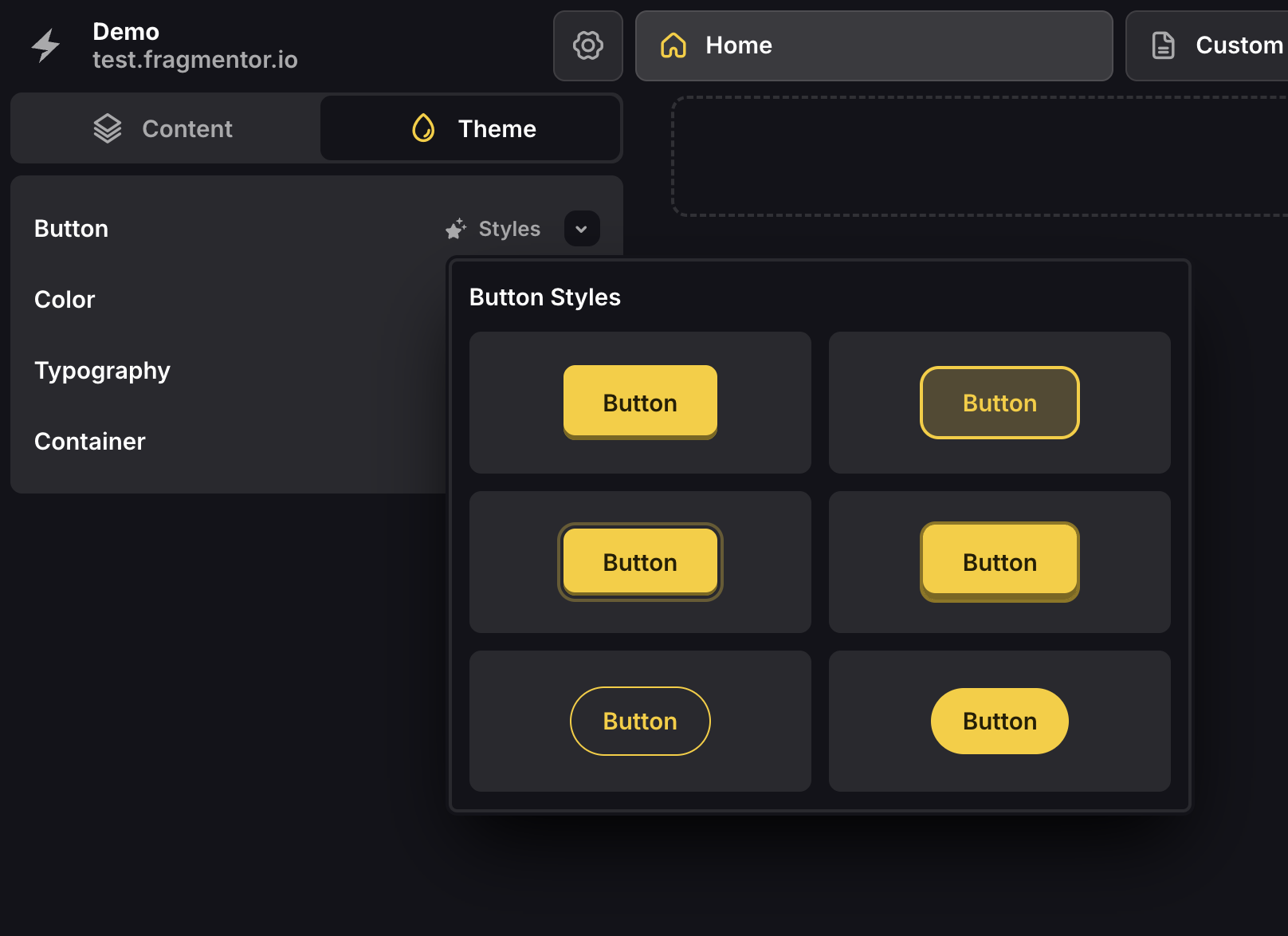
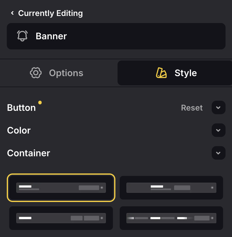
Button
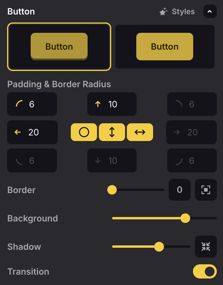
- Button State — There are two button states “Normal” and “Hover”, for which you can configure styling independently. At the very top of the button theme group, you’ll find two preview buttons to toggle between these two states. When the first is select, you’ll find all styling options when the button is in the normal state. When the second is selected, you’ll find all styling options when the button is in the hover state.
- Padding & Border Radius — Here you can edit the padding (inner spacing) and border radius (roundness) of the button. Typically, you’d have equal spacing in the horizontal direction, and equal spacing in the vertical direction, but you’re free to modify things as you wish.
- Border — The slider can be used to configure border opacity. The numbered button next to the slider indicates the border width. The very last button expresses the location of the border (can be inner, outer or outline).
- Background — The slider can be used to configure background opacity.
- Shadow — The slider can be used to configure shadow opacity. The button next to the slider expresses the location of the shadow (can be inner or outer).
- Transition — This toggle option allows you to enable or disable the transition effect when hovering over the button.
Color
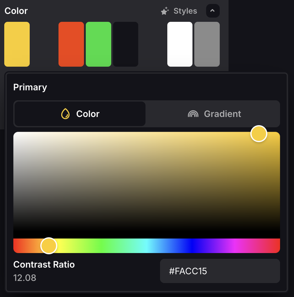
- Primary — Used for primary buttons and some subtitles. This color is the main accent color, should be used sparingly and reflect your brand.
- Secondary — Used for secondary buttons. This color is used for buttons that require less attention.
- Danger — Used for potentially “dangerous” actions (e.g. closing a modal, removing a product from the basket).
- Success — Used for confirmation buttons.
- Background Primary — Used for the background of the body.
- Background Secondary — Used for the background of containerized fragments. This color may also serve as an accent to the main background.
- Foreground Primary — Used for titles and text that needs emphasis. This color should have a high contrast ratio with the primary background color.
- Foreground Secondary — Used for paragraphs, and in some cases subtitles or text that doesn’t require much attention. This color should have a high contrast ratio with the primary background color, and be ever so slightly different from the primary foreground color for better visual hierarchy.
Typography
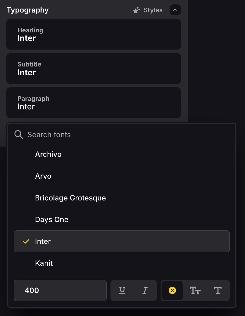
- Heading — Used for titles, headings and buttons.
- Subtitle — Used for subtitles (small headings).
- Paragraph — Used for paragraphs.
We only allow you to use up to three different fonts. This is to ensure that your webstore remains consistent and doesn’t become a mess of different fonts. Furthermore, adding more different fonts will slow down your webstore.
Container
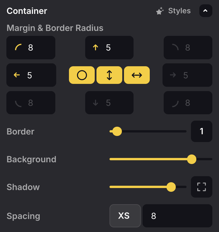
- Margin & Border Radius — Here you can edit the margin (outer spacing) and border radius (roundness) of the container.
- Border — The slider can be used to configure border opacity. The numbered button next to the slider indicates the border width.
- Background — The slider can be used to configure background opacity.
- Shadow — The slider can be used to configure shadow opacity. The button next to the slider expresses the location of the shadow (can be inner or outer).
- Spacing — The select option allows you to select a certain spacing measure and edit its value. Spacing measures are used within fragments to ensure that the spacing between elements is consistent. You can configure XS (eXtra Small), SM (SMall), MD (MeDium), LG (LarGe).
Theme Versus Fragment Style
Changes made to “Theme” apply to your entire webstore unless overriden by “Fragment Styles”.
Whenever you notice a fragment is not changing styles with the global theme, it might be you’ve overridden specific styles within that fragment.